


Client
Dermatologie am Hauptplatz
Branding
Objective
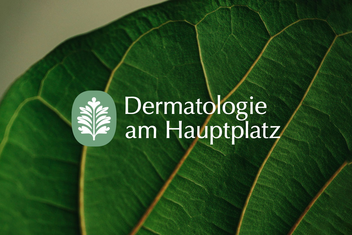
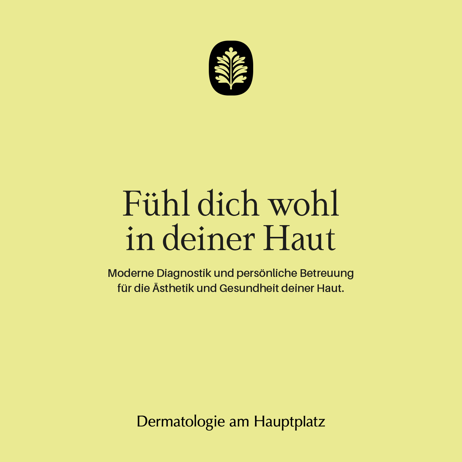
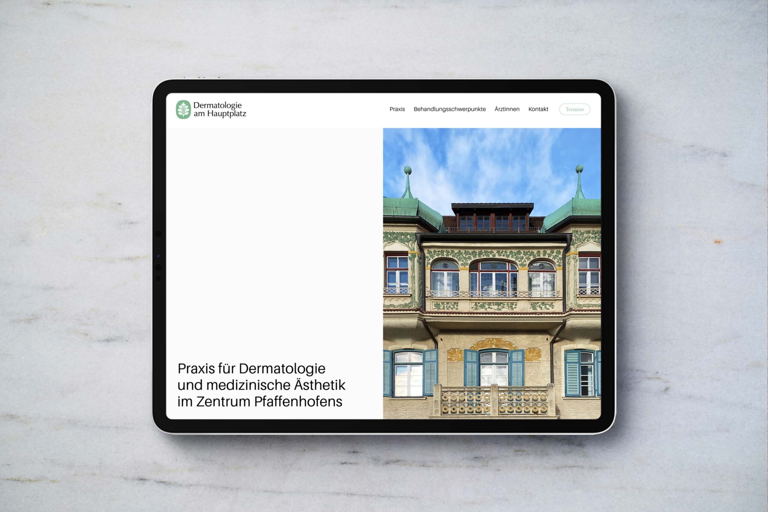
While many medical and healthcare brands adopt a sterile and generic look, we aimed to create a visual identity that feels friendly, trustworthy, and light—evoking comfort, healing, and beauty.
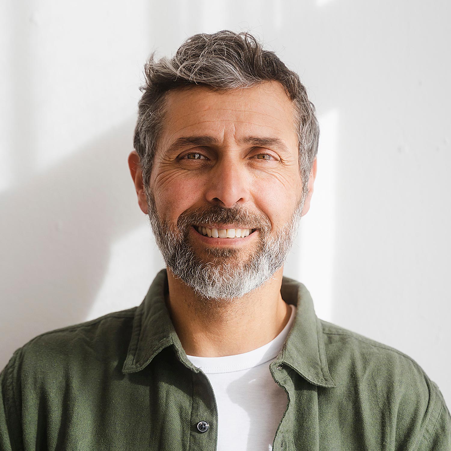
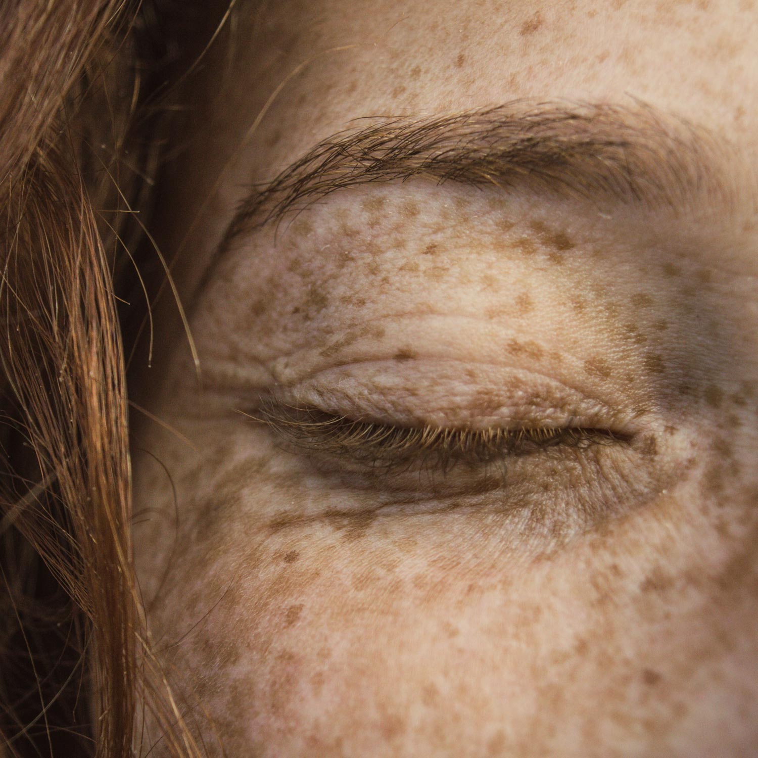
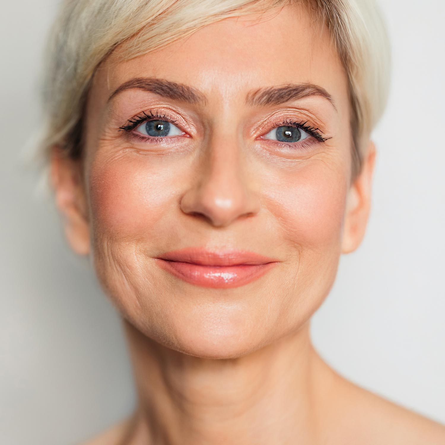
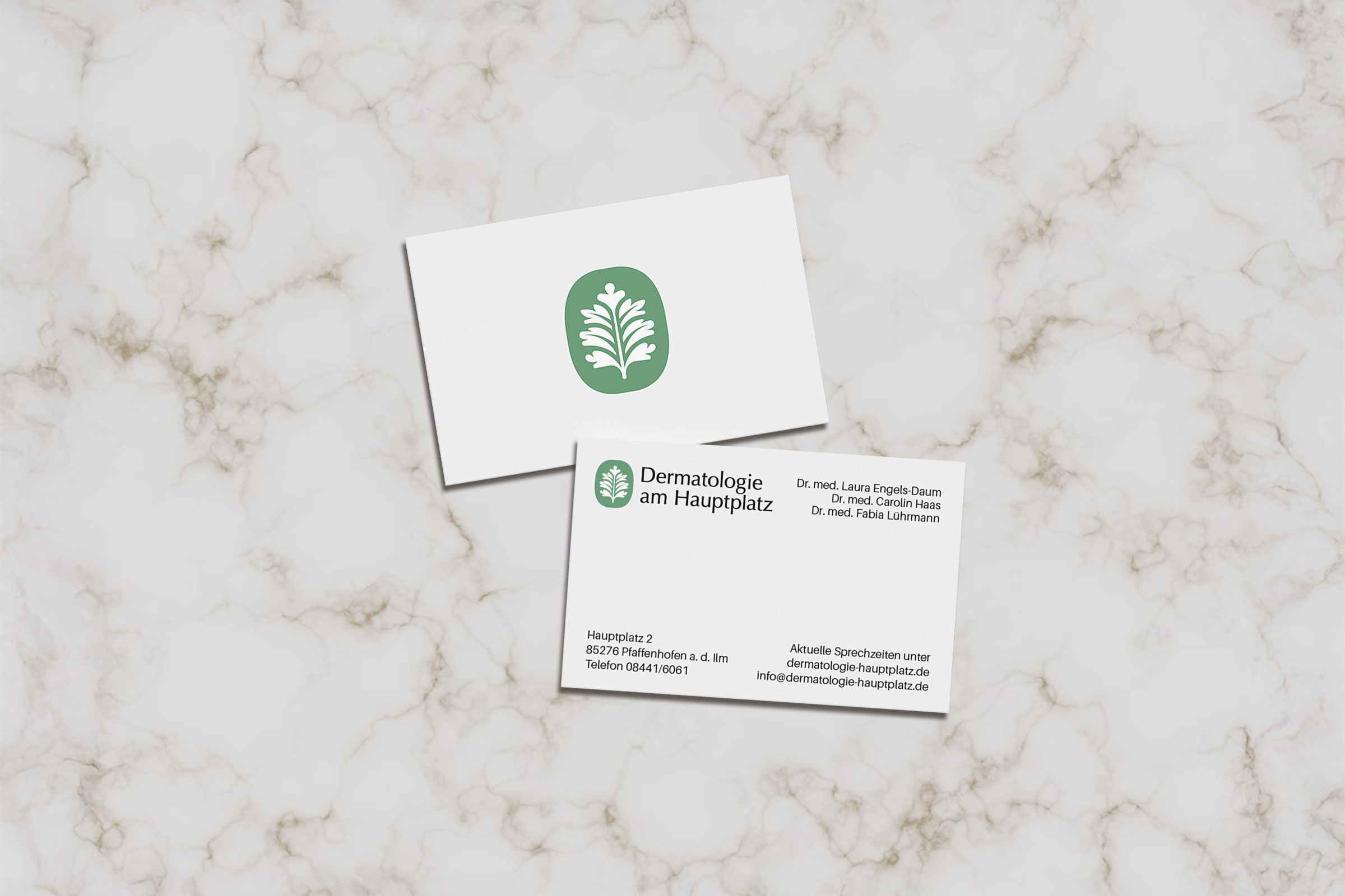
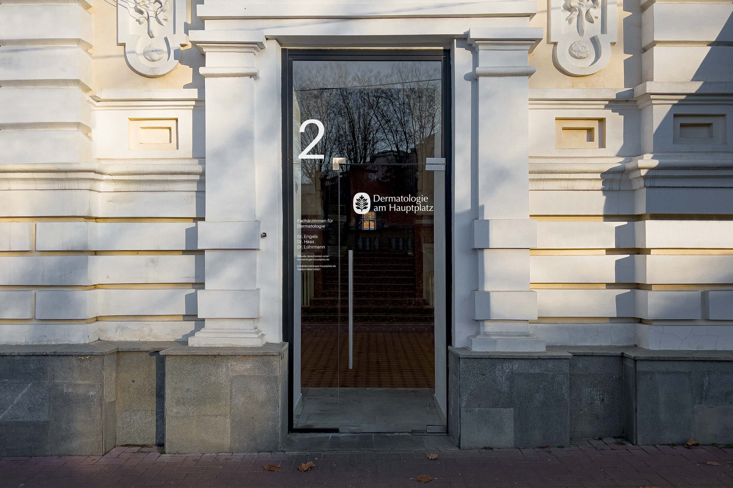
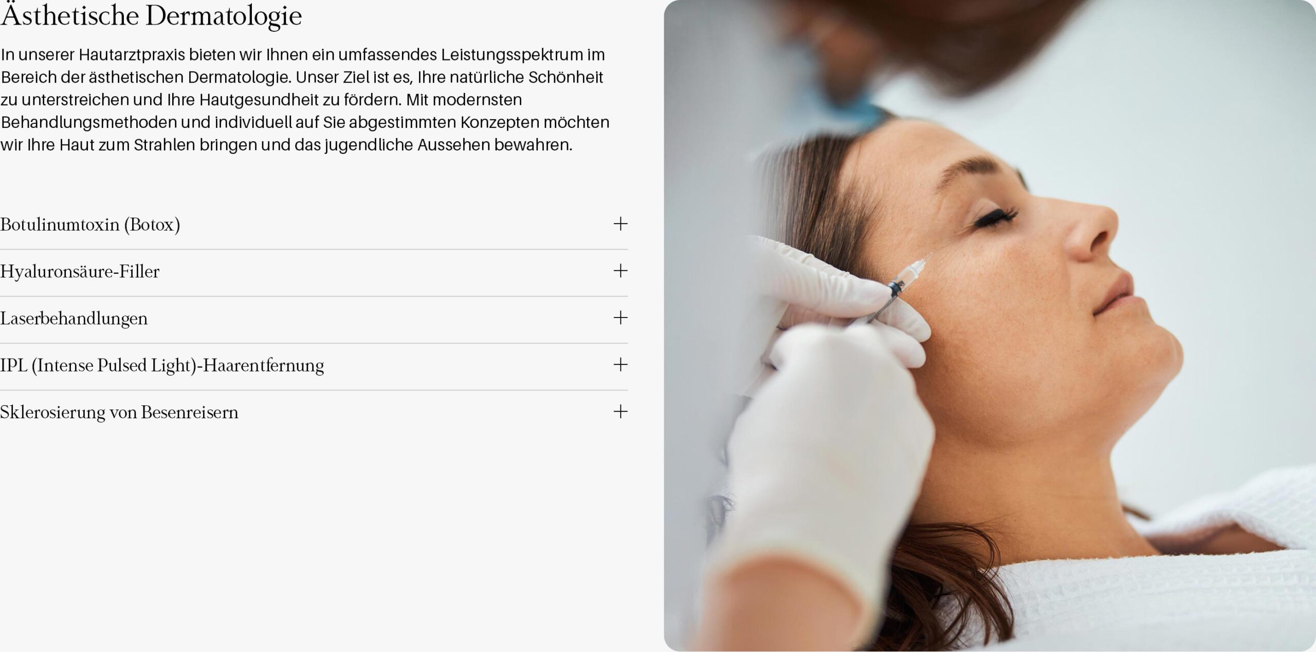
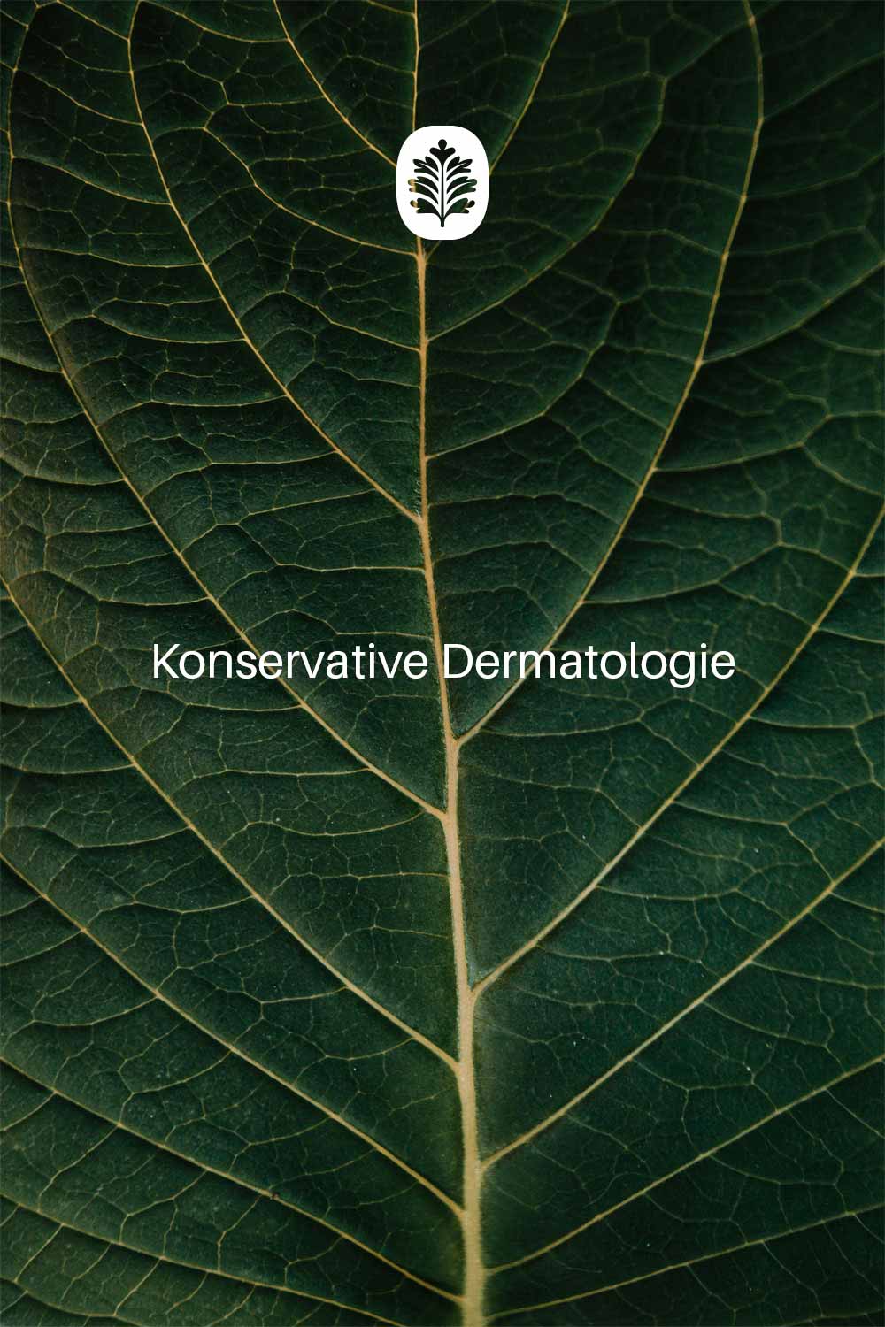
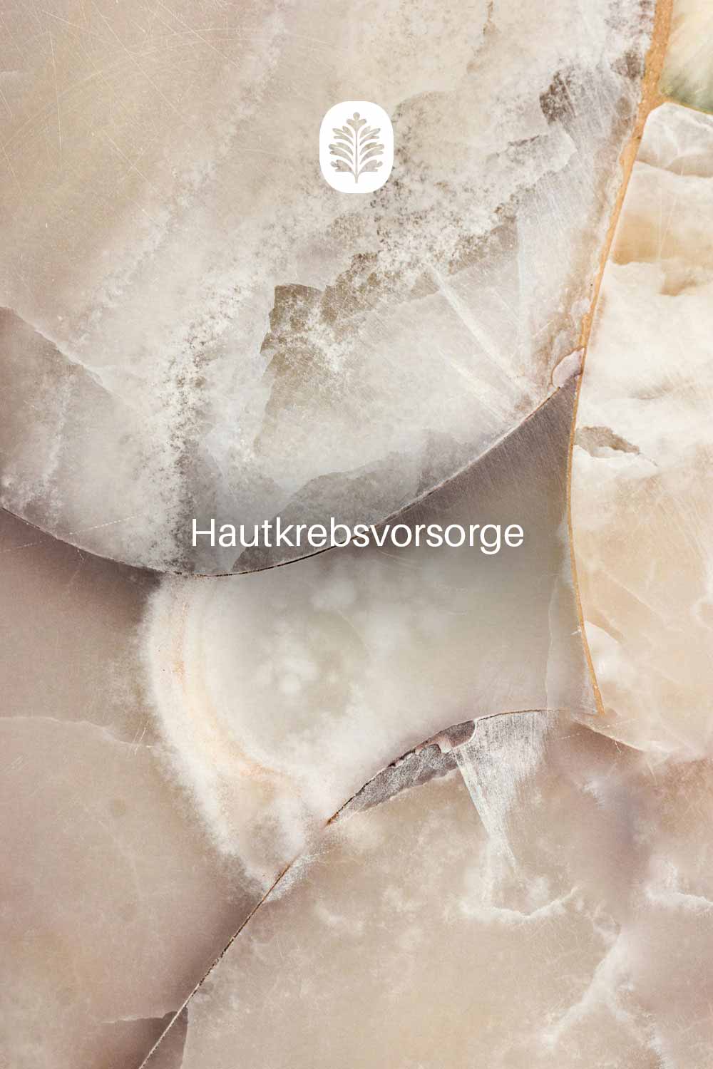
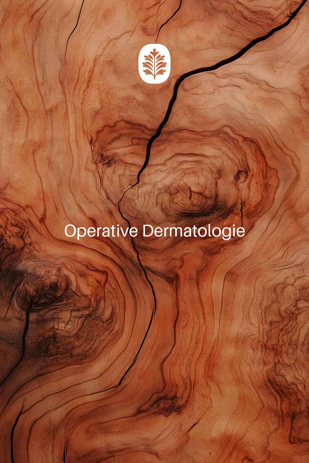
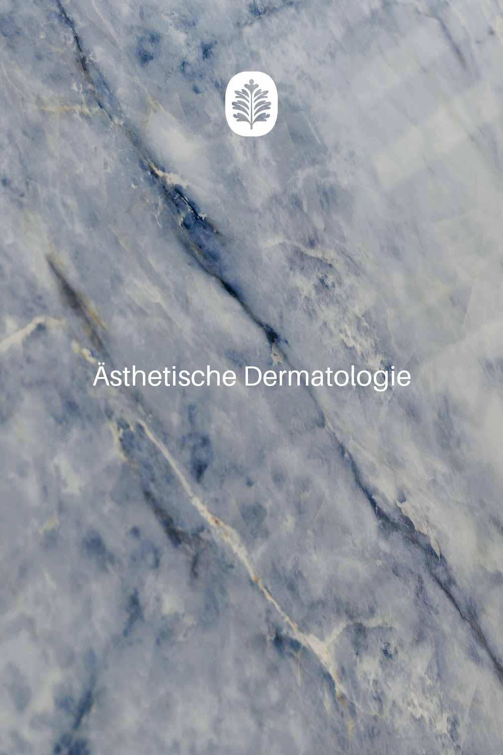
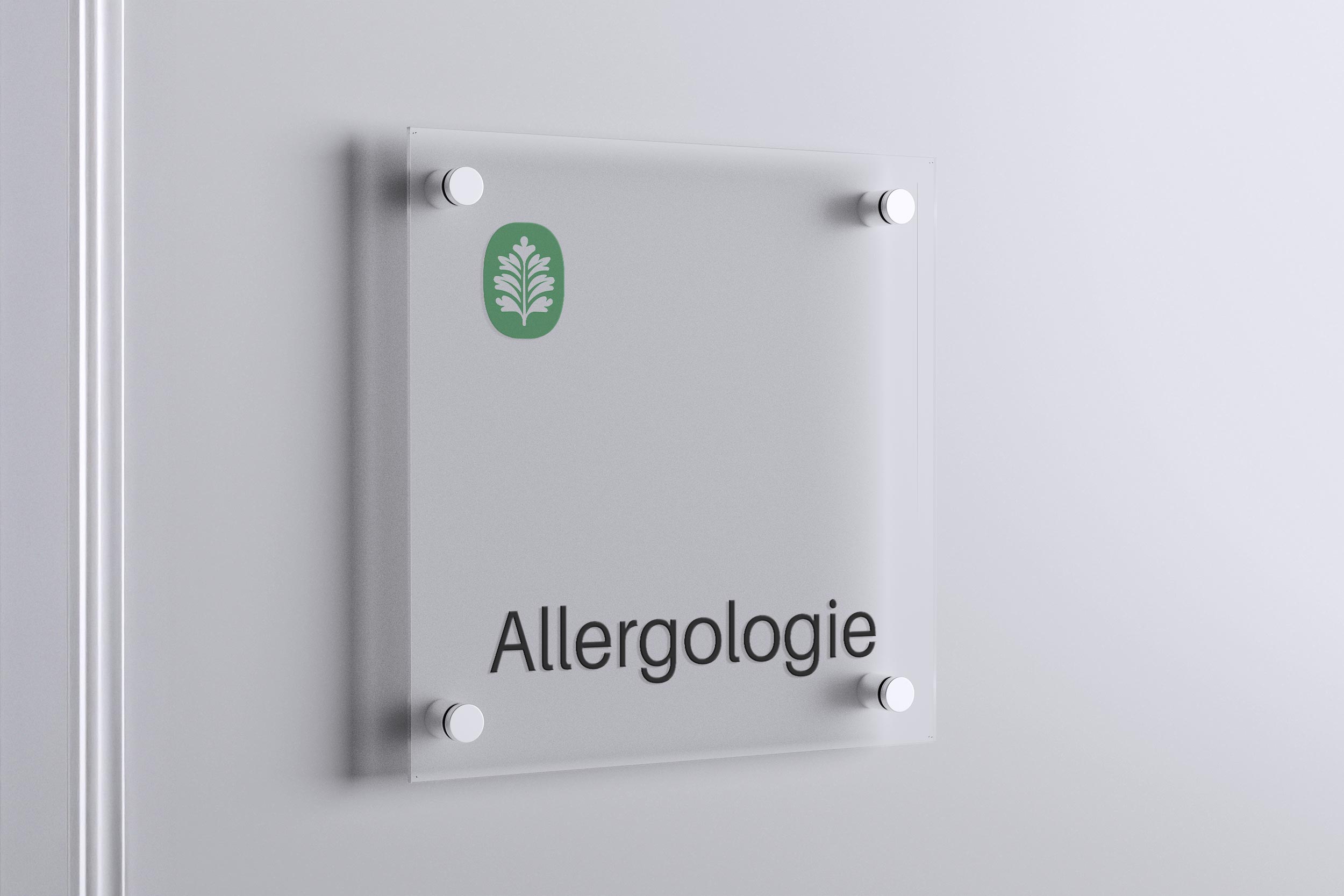
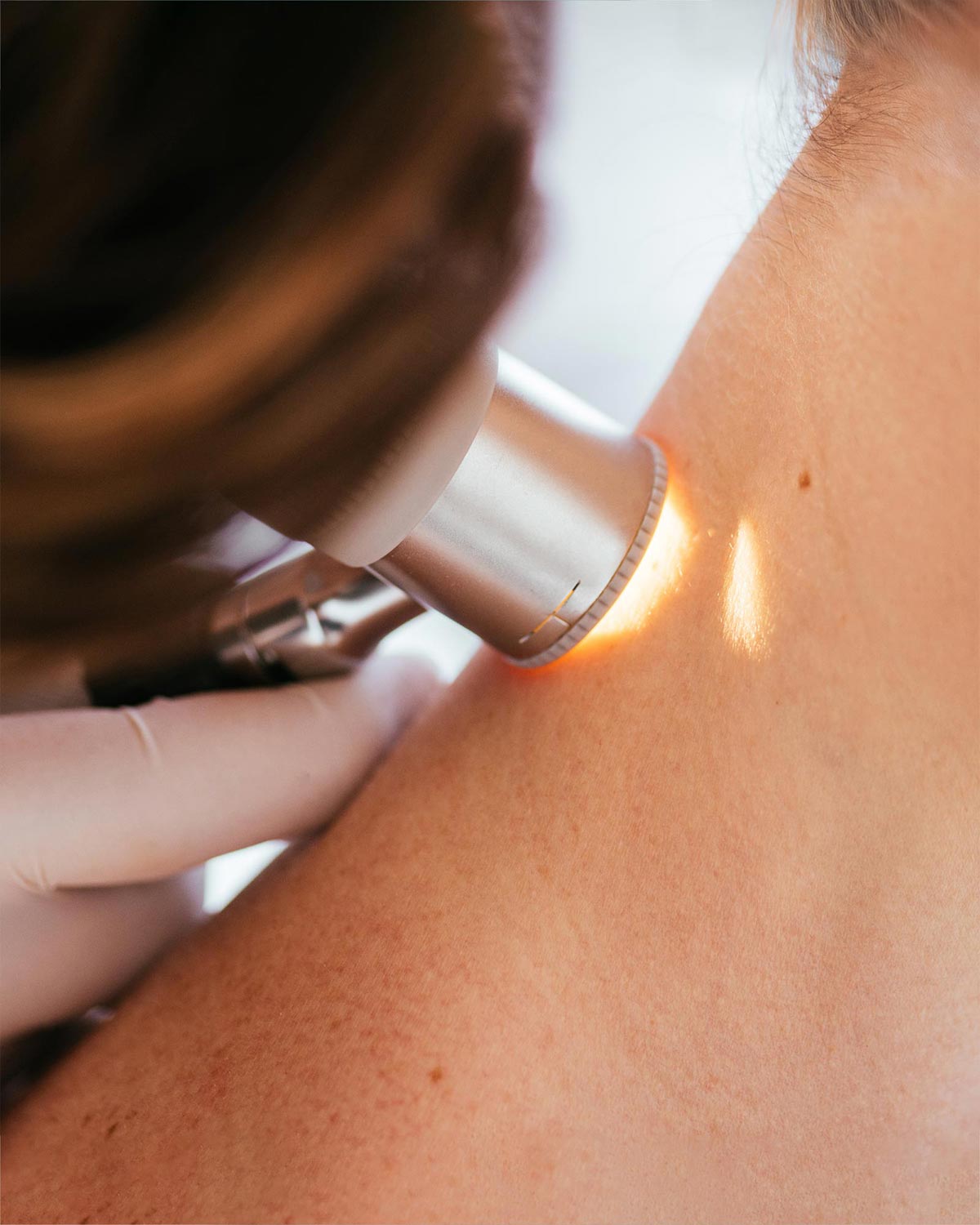
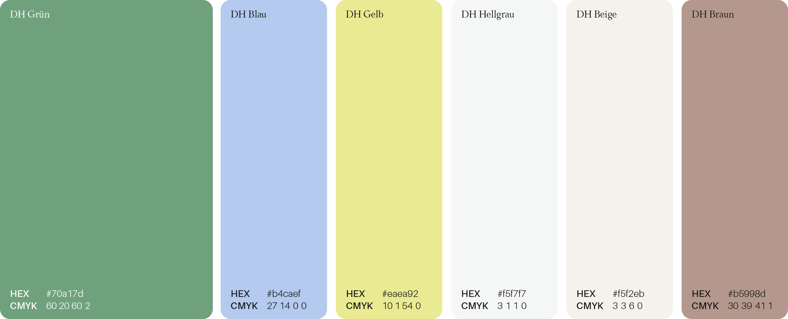
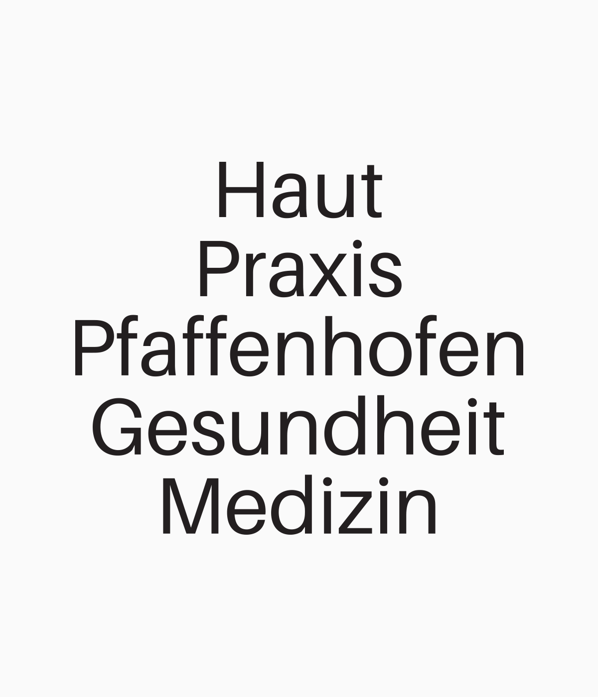
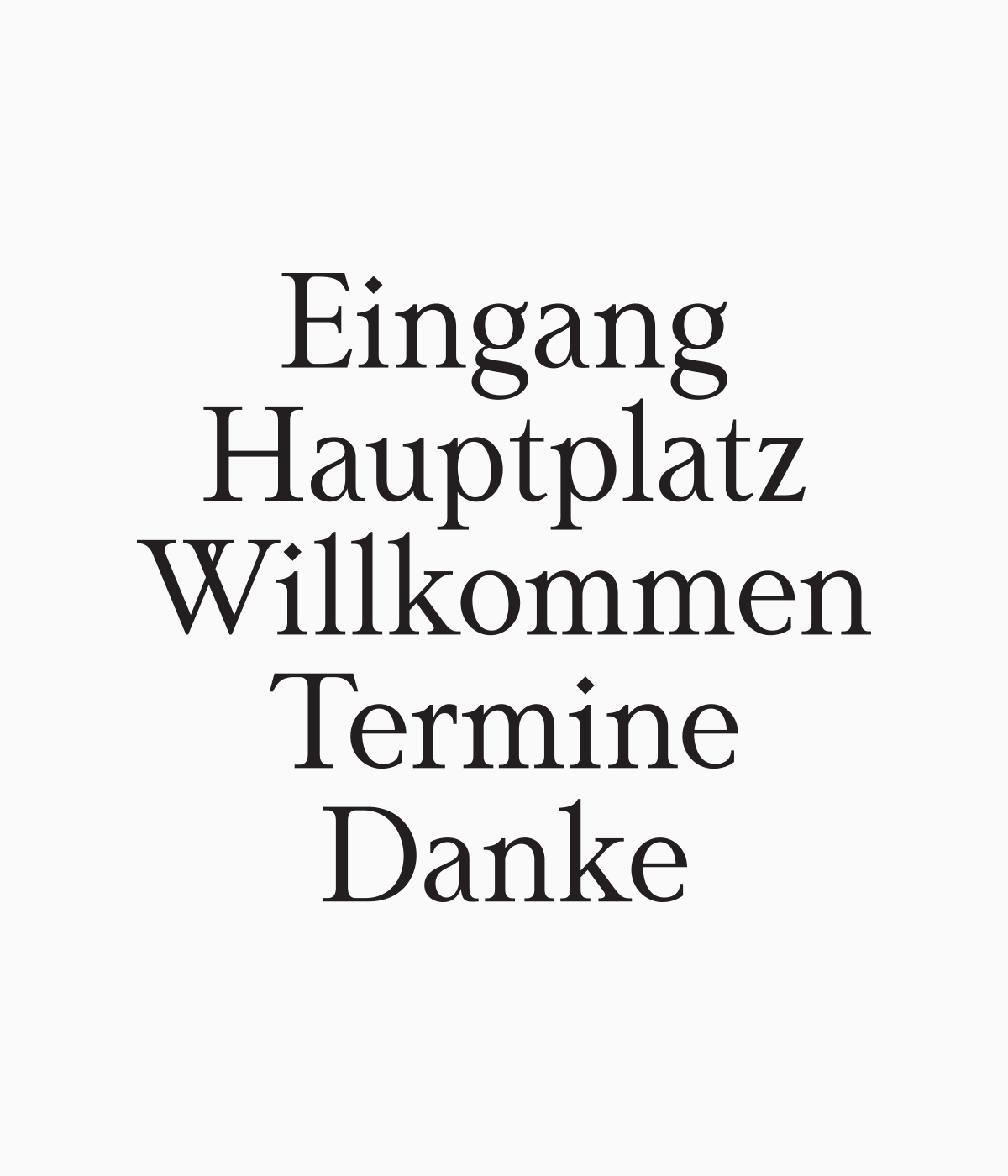
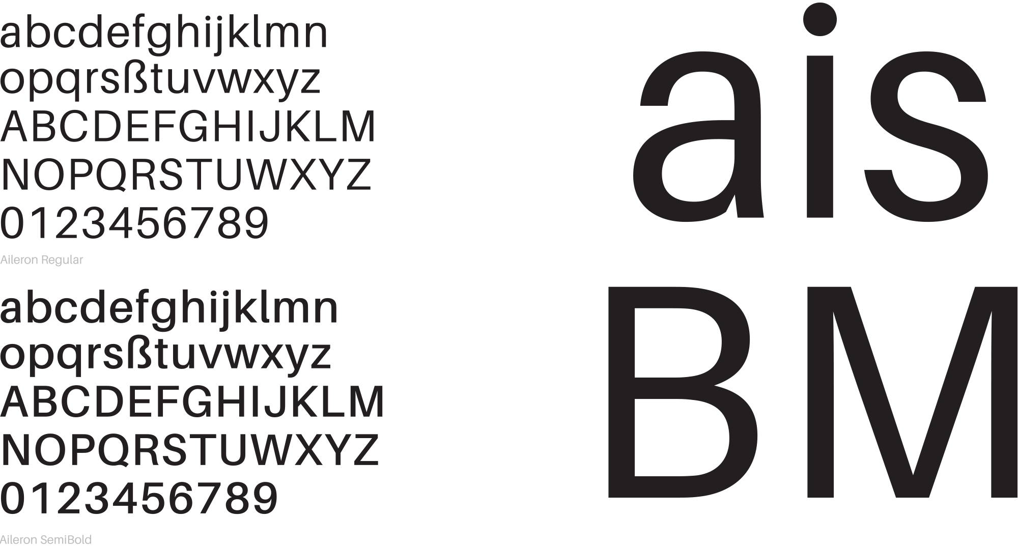
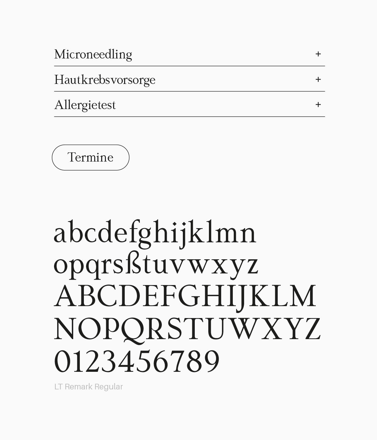
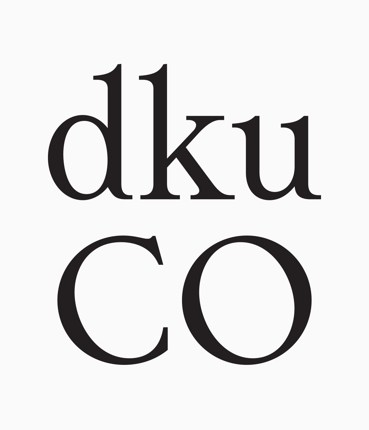
The logo combines wordmark and pictorial elements, featuring a leaf that symbolizes healing and aesthetics while also representing the clinic’s three founders. The typography uses a neo-grotesque sans serif known for its clean clarity and subtle elegance, offering a timeless yet contemporary feel. This is complemented by a serif display typeface with refined strokes and playful details, adding a sense of quality, precision, and lightness—all while maintaining visual harmony. Rather than relying on clichéd stock photos of smiling doctors and patients, we focused on authentic, inviting imagery that feels credible and aesthetically pleasing. We deliberately avoided depictions of diseases or clinical close-ups of skin. Instead, we interpreted skin as a surface, allowing us to work with natural textures like leaves, stone, and wood—emphasizing the organic quality of skin in a more visually appealing way. The color palette is subtle yet vibrant, creating a harmonious and dynamic aesthetic. A muted green serves as the primary color, used prominently—especially on white—for the logo and typographic highlights. Secondary colors add depth and variety through backgrounds and accents while preserving the calm and balanced overall tone.
Dermatologie am Hauptplatz is a dermatology clinic based in Pfaffenhofen an der Ilm, Germany.
Portfolio
Selected Artwork
Let’s do something outstanding together!
Do you have a project or an idea? Feel free to contact me for inquiries, freelance opportunities or just to say hi!
© 2025 David Weigert
www.davidweigert.com
